The bedroom is your ultimate retreat, a place where the day begins and ends. Unlike high-energy areas like kitchens or living rooms, a bedroom requires colors that promote calm, relaxation, and wellness. The right color palette can significantly enhance your comfort, making it easier to unwind and encouraging better sleep.
At Maple Crest Painting, we specialize in creating serene and personalized spaces, and we know that the key to a perfect bedroom lies in strategic color application.
Why Bedroom Color Choice Matters
The psychology of color is particularly potent in a bedroom setting, where the visual environment has a direct line to your mental and physical state.
Influences Sleep Quality and Mood
Colors are known to affect the production of melatonin, the hormone that regulates sleep. Cool, muted, and soft colors are generally associated with tranquility, reduced heart rate, and improved rest.
- Soothing Colors: Blues, greens, and soft neutrals create a peaceful foundation, signaling to the brain that it’s time to relax. These hues can help reduce stress and anxiety, which are often barriers to falling asleep.
- Stimulating Colors (Avoid): Bright reds, vibrant oranges, and intense yellows should be used sparingly, if at all. These colors are high-energy and exciting, making them counterproductive in a room dedicated to rest.
Enhances Natural Light and Space Perception
The bedroom’s color directly impacts how large or small the space feels, especially if natural light is limited (a common scenario with smaller bedroom windows).
- Maximizing Space: Lighter colors (high Light Reflectance Value or LRV) reflect more light, making the walls visually recede and causing the room to feel significantly more spacious and airy.
- Creating Intimacy: Darker colors absorb light and make the walls feel closer, which can create a cozy, cocoon-like, and intimate atmosphere, often desirable in larger primary suites.
Trending Bedroom Colors for 2025
The current trend leans heavily into nature-inspired, soothing, and sophisticated neutrals that prioritize comfort over visual stimulation.
Soft Blue and Sage Green for Relaxation
These nature-inspired hues are scientifically proven to be among the most relaxing colors, making them ideal choices for promoting deep sleep.
- Soft Blue: Think dusty, gray-infused blues or pale sky blues, rather than vibrant cobalt. Blue tones are linked to a sense of order and peace, and they remain timelessly popular in the bedroom.
- Sage Green: A muted, grayish-green is currently trending for its organic, grounding feel. Sage works well with both warm wood tones and cool metallic accents, offering a sophisticated neutral that brings the tranquility of nature indoors.
Warm Beige and Taupe for Cozy Comfort
If you prefer a warm, comforting feel, beige and taupe offer depth without the starkness of a cool white.
- Taupe: This color is a warm blend of gray and brown. It is a fantastic chameleon color that provides grounding depth and pairs beautifully with other rich textures like linen, wool, and velvet, making the room feel cozy and luxurious.
- Warm Beige: Look for beiges that have a slight pink or yellow undertone. These soft neutrals act like a blanket, wrapping the room in a gentle warmth that is inviting and easy on the eyes.
Greige and Off-White for Modern Minimalism
For a contemporary, uncluttered aesthetic, refined neutrals provide the perfect backdrop.
- Greige: The perfect balance of gray and beige, greige offers a sophisticated, adaptable neutral that avoids feeling cold. It is a highly popular choice for minimalist design as it allows furniture and artwork to take center stage while keeping the room feeling serene.
- Off-White: Instead of true, blinding white, opt for an off-white with subtle, warm undertones (like cream or ivory). This shade provides brightness and cleanliness while softening the contrast between the walls and the ceiling, contributing to a seamless, restful environment.
Tips for Choosing the Right Shade
The decision process involves more than just liking a color; it’s about how that color behaves in your specific space.
Test Samples Under Different Lighting
The color that looks perfect on a swatch in a hardware store can look completely different on your wall once applied.
- Ambient Light: Bedroom lighting changes dramatically throughout the day. Place large swatches (at least 12 X 12 inches) of your top three choices on each wall.
- Observe Throughout the Day: View the colors in the morning (when natural light is strongest), in the afternoon, and at night under your lamps and overhead fixtures. This allows you to see how the hue shifts from bright and washed out to cozy and saturated.
Match Tones with Bedding and Flooring
To ensure a cohesive and balanced look, consider the permanent elements already present in your room.
- Undertones: If your wooden flooring or furniture has warm, reddish undertones, choose a paint color with similar warm undertones (like a warm greige or beige). If your bedding or carpet is a cool gray or stark white, choose a paint with cool undertones (like a soft blue or a true gray). Clashing undertones create a jarring, unbalanced feeling.
Maple Crest Painting Advice
Our experience ensures not only the correct color application but also the right product choice for durability and aesthetics.
Use Matte Finish for Walls and Satin for Trim
The sheen you choose is just as important as the color itself.
- Walls (Matte/Flat): We highly recommend a flat or matte finish for the main wall surfaces. This low-luster finish absorbs light, effectively hiding minor surface imperfections and providing the soft, velvety texture most conducive to a restful environment.
- Trim (Satin): Use a satin or semi-gloss finish on all trim, baseboards, and doors. The slight shine creates a subtle contrast with the matte walls, providing visual architectural definition and offering a more durable, wipeable surface.
Combine Light Walls with Darker Accents
If you love the calming effect of light walls but crave depth, use a two-tone strategy.
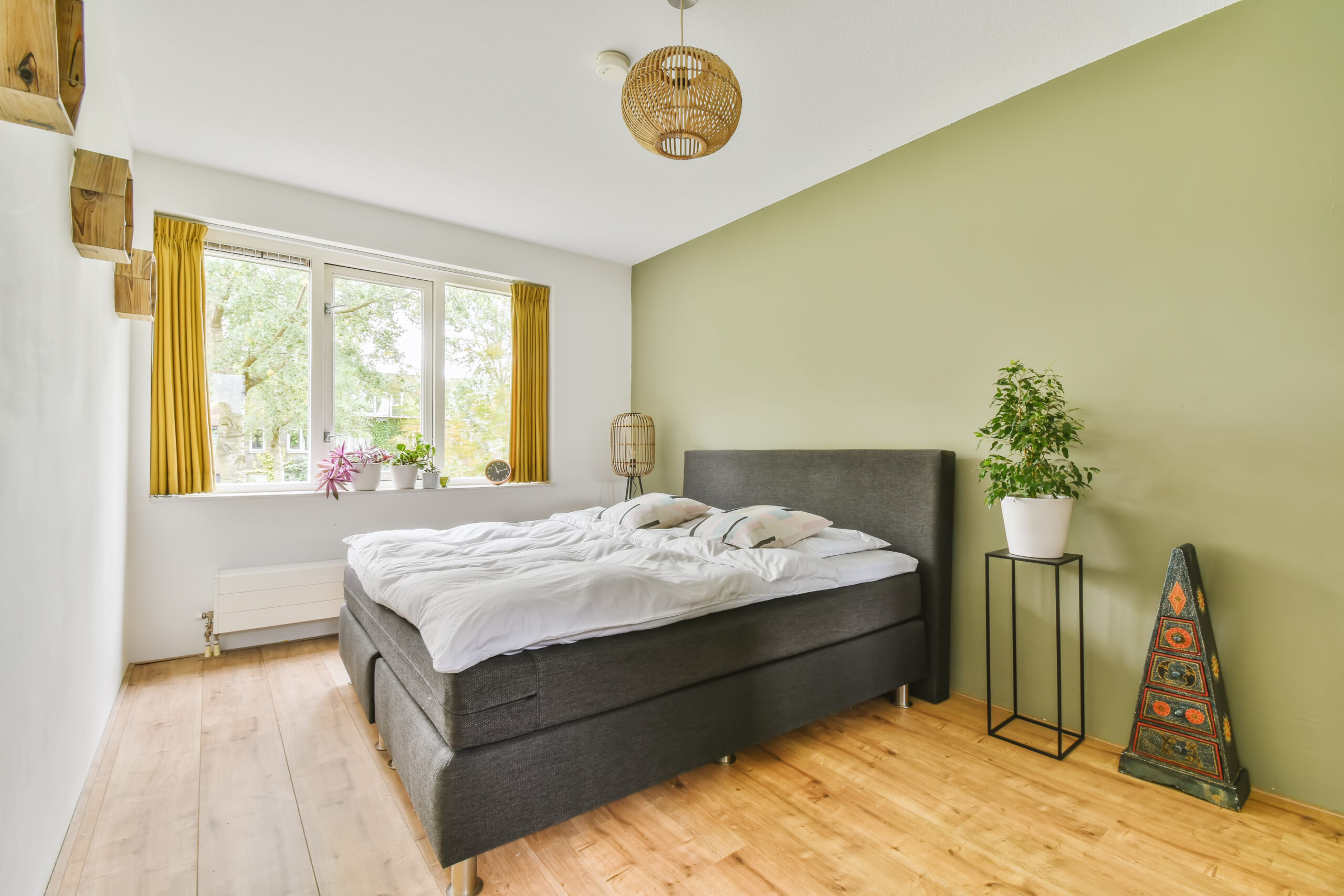
- Accents: Instead of painting all four walls dark, maintain a light, airy base color on three walls and use a deeper, complementary color (such as a deep navy, charcoal, or forest green) on one accent wall behind the headboard.
- Contrast: Alternatively, keep all walls light and introduce the darker color through architectural elements, like a painted fireplace mantle, built-in shelving, or the door frame itself. This strategy provides sophisticated contrast without compromising the room’s overall light and calming atmosphere.
FAQs
What color promotes the best sleep?
Soft, muted blues and light, silvery greens are consistently recommended by sleep experts for promoting the best sleep. These cool, passive colors are known to lower heart rate and blood pressure more effectively than warm tones, creating an optimal environment for rest.
Should bedroom ceilings be painted white or colored?
Traditionally, ceilings are painted a flat white to maximize height and reflection. However, there are two exceptions:
- Color Drenching: For a modern, cozy, and enveloping effect, paint the ceiling the same color as the walls (or one shade lighter). This blurs the transition between wall and ceiling, making the room feel like a unified sanctuary.
- Tall Ceilings: If you have an exceptionally tall ceiling, a deeper, softer color can be used on the ceiling alone to visually lower the height, creating a more intimate and less cavernous feel.
Ready to wake up to a beautifully balanced and restful bedroom? Our experts can help you select the perfect, light-tested shade and provide a flawless finish.
Click here to schedule your color consultation and receive a free estimate from Maple Crest Painting today!