Grey is more than just a shade; it’s a spectrum of complex, multifaceted neutrals that provides the ultimate sophisticated foundation for your living room. From airy silver to deep charcoal, grey has evolved from a trend to a fundamental element of modern interior design, offering elegance that never fades.
At Maple Crest Painting, we specialize in understanding the subtle nuances of color undertones to ensure the grey you choose performs perfectly in your unique space. Here is our essential guide to mastering the grey palette.
Why Grey Remains a Top Interior Color
While other colors rise and fall in popularity, grey’s status as a premier interior color endures. Its success lies in its ability to anchor a room while remaining visually subdued.
Complements Any Design Style
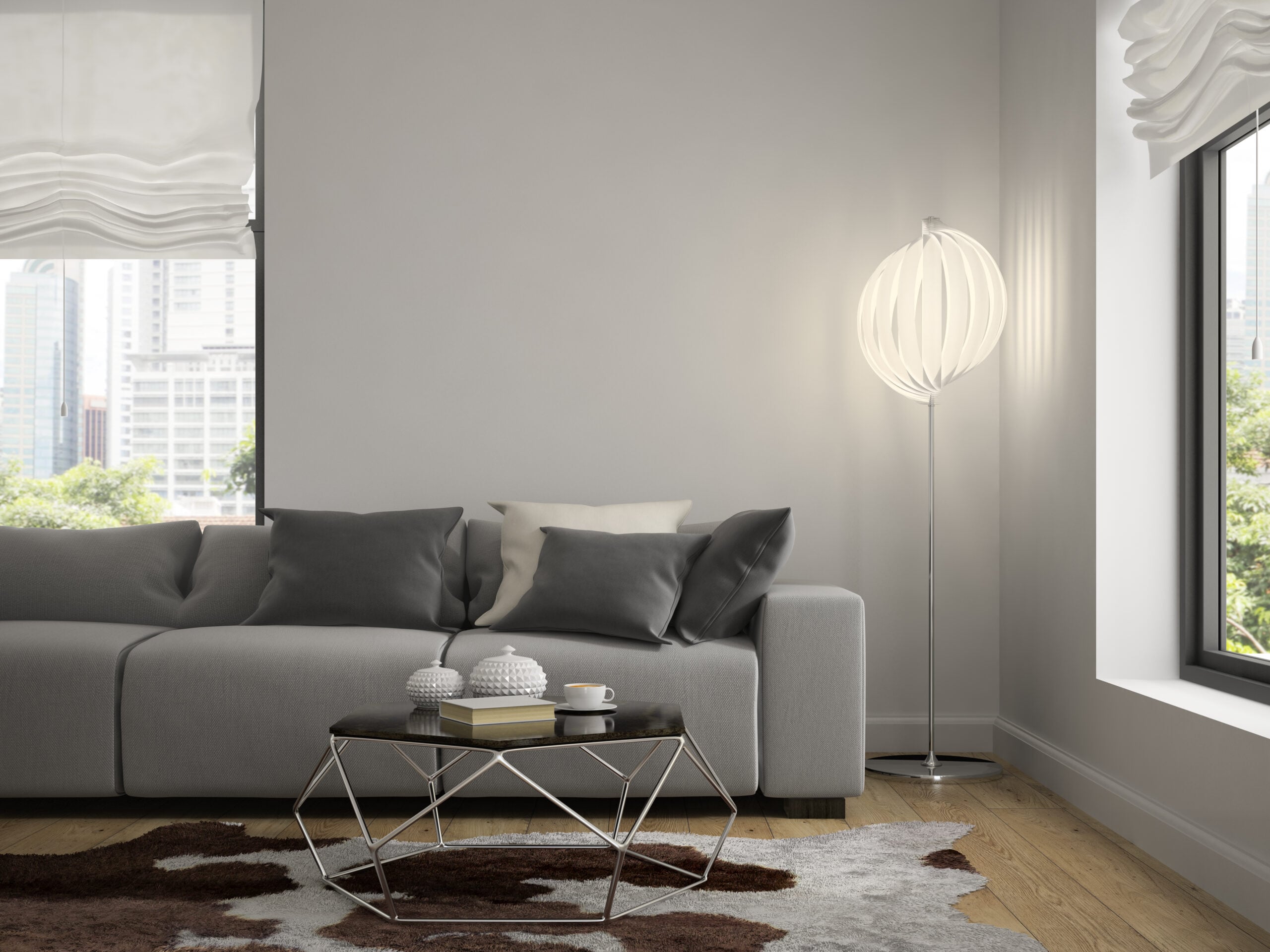
Grey’s neutrality makes it the ultimate chameleon. Whether your personal style leans toward a cozy farmhouse aesthetic or sharp, industrial minimalism, grey adapts effortlessly.
- Modern Styles: Light, cool grays paired with white trim create a clean, crisp backdrop essential for Scandinavian, minimalist, and contemporary designs.
- Traditional Styles: Warmer, deeper grays (like taupes and charcoals) lend a historic, sophisticated feel that grounds classic furnishings, ornate moldings, and rich textiles like velvet and tweed.
Works Beautifully with Wood Tones and Metals
Grey provides a perfect, contrasting surface for natural and industrial materials, maximizing their visual impact.
- Wood Tones: Light grey walls allow the warm, natural grain of wood (like oak, walnut, or maple) to stand out, adding necessary warmth and organic texture to the room. Conversely, dark charcoal walls make lighter wood furniture look crisp and modern.
- Metallic Accents: Grey’s inherent coolness is instantly warmed and elevated by metals. Brushed brass and antique gold accents provide a luxurious contrast, while matte black and polished chrome offer a sharp, contemporary edge against the soft wall color.
Types of Grey Paint Tones
The secret to choosing the right grey is understanding its undertone. Grey is rarely pure; it carries hidden hints of blue, green, violet, or beige that dictate how it performs under different lights.
Cool Grays with Blue Undertones
Cool grays are created by adding a touch of blue, green, or violet to the mixture. These grays feel clean, crisp, and expansive.
- Atmosphere: They are excellent choices for rooms that receive a lot of warm, direct sunlight (South or West-facing rooms), as the cool tone helps balance the intensity of the light, creating a refreshing atmosphere.
- Styling: Pair cool grays with cool-toned accents like crisp white trim, silver metals, and cool-colored artwork (blues, greens, purples) to enhance the sophisticated, calming feel.
Warm Greys with Beige or Taupe Hints
These are the highly sought-after “greiges”—shades where the gray is softened by a noticeable beige or taupe (a reddish-brown) component.
- Atmosphere: Warm greys are ideal for North or East-facing rooms that tend to feel darker or receive cooler light. The beige undertone introduces necessary warmth, preventing the room from feeling cold or gloomy.
- The Power of Greige: Greige acts as a bridge, successfully connecting warm elements (like brown leather furniture or rich wood floors) with cooler ones (like stainless steel appliances or white quartz countertops), providing ultimate harmony.
Charcoal for Bold Contrast
Charcoal is a deep, dramatic grey, often leaning toward black without fully committing to it.
- Atmosphere: This tone is inherently bold and enveloping. It’s perfect for creating a cozy, moody, and intimate space, especially in a smaller living room or on an accent wall.
- Technique: When using charcoal on all walls, ensure the ceiling and trim are painted a crisp white. This contrast is vital for defining the room’s architecture and preventing the space from feeling too heavy. Charcoal acts as an exceptional backdrop for vibrant, colorful art.
Styling Tips for Grey Living Rooms
While grey is versatile, it requires thoughtful styling to ensure the room feels inviting and not clinical or stark.
Pair with Soft Furnishings for Warmth
Since grey walls can sometimes read as cold, the decor should focus on introducing texture and warmth.
- Natural Materials: Prioritize fabrics like thick wool, cotton, linen, faux fur, and chunky knits. A large area rug in a natural fiber like jute or sisal is essential for adding warmth underfoot.
- Warm Color Pops: Introduce accent colors in the decor that feature inherent warmth—think terracotta, deep amber, burnt orange, or mustard yellow—to keep the overall atmosphere balanced and inviting.
Use Layered Lighting to Avoid a Cold Feel
Lighting is critical in a grey room, as the color will absorb some light. Relying on a single overhead light source will make the room look flat and potentially cold.
- Multiple Sources: Use at least three layers of light: ambient (overhead/pot lights), task (reading lamps), and accent (picture lights or floor lamps).
- Warm Bulbs: Opt for warm-toned LED bulbs (around 2700K or “soft white”). The warm light counteracts any potential coolness in the grey paint, creating a flattering, cozy glow throughout the room.
Maple Crest Painting Recommends
These two colors are consistently our top-requested greys because they are perfectly balanced and reliably beautiful in various home settings.
Benjamin Moore “Revere Pewter” (HC-172)
- Why We Love It: Revere Pewter is the quintessential greige. It’s a medium-light grey that possesses strong, warm undertones of beige and sometimes a hint of green.
- Best Application: It performs exceptionally well in rooms with strong natural light, where it manages to look substantial without ever becoming overwhelming. It is the gold standard for connecting diverse color palettes in open floor plans.
Sherwin-Williams “Agreeable Gray” (SW 7029)
- Why We Love It: Agreeable Gray is slightly lighter and softer than Revere Pewter, with a delicate, balanced warmth. It is perhaps the most universally beloved greige available.
- Best Application: Its near-perfect neutrality allows it to complement both cool marble and warm granite. It’s an excellent choice for clients who want a sophisticated neutral but are hesitant about too much depth or color commitment.
FAQs
What’s the difference between greige and gray?
The difference lies in the base colors:
- Gray: A mixture of black and white, often carrying blue, green, or violet (cool) undertones.
- Greige: A mix of gray and beige. It is essentially a warm-toned gray, where the presence of beige (which has yellow/brown undertones) prevents it from looking stark or cold. Greige is generally considered a safer, more welcoming choice for living spaces.
What trim color goes best with gray walls?
For modern elegance and maximum impact, a crisp, clean white is unbeatable. Specifically, we recommend a slight contrast:
- If the walls are a warm greige: Use a bright white trim with a slight cool undertone to make the trim pop against the warm walls.
- If the walls are a cool gray: Use a bright white trim with a slight warm undertone to soften the overall appearance.
Tip: A slight sheen difference (e.g., flat on the walls, semi-gloss on the trim) will define the lines even if the white is the same shade.
A sophisticated grey awaits your living room. Let us help you navigate the undertones to find the perfect hue that complements your home and style.
Ready to transform your walls? Contact Maple Crest Painting today for a professional color consultation and estimate!