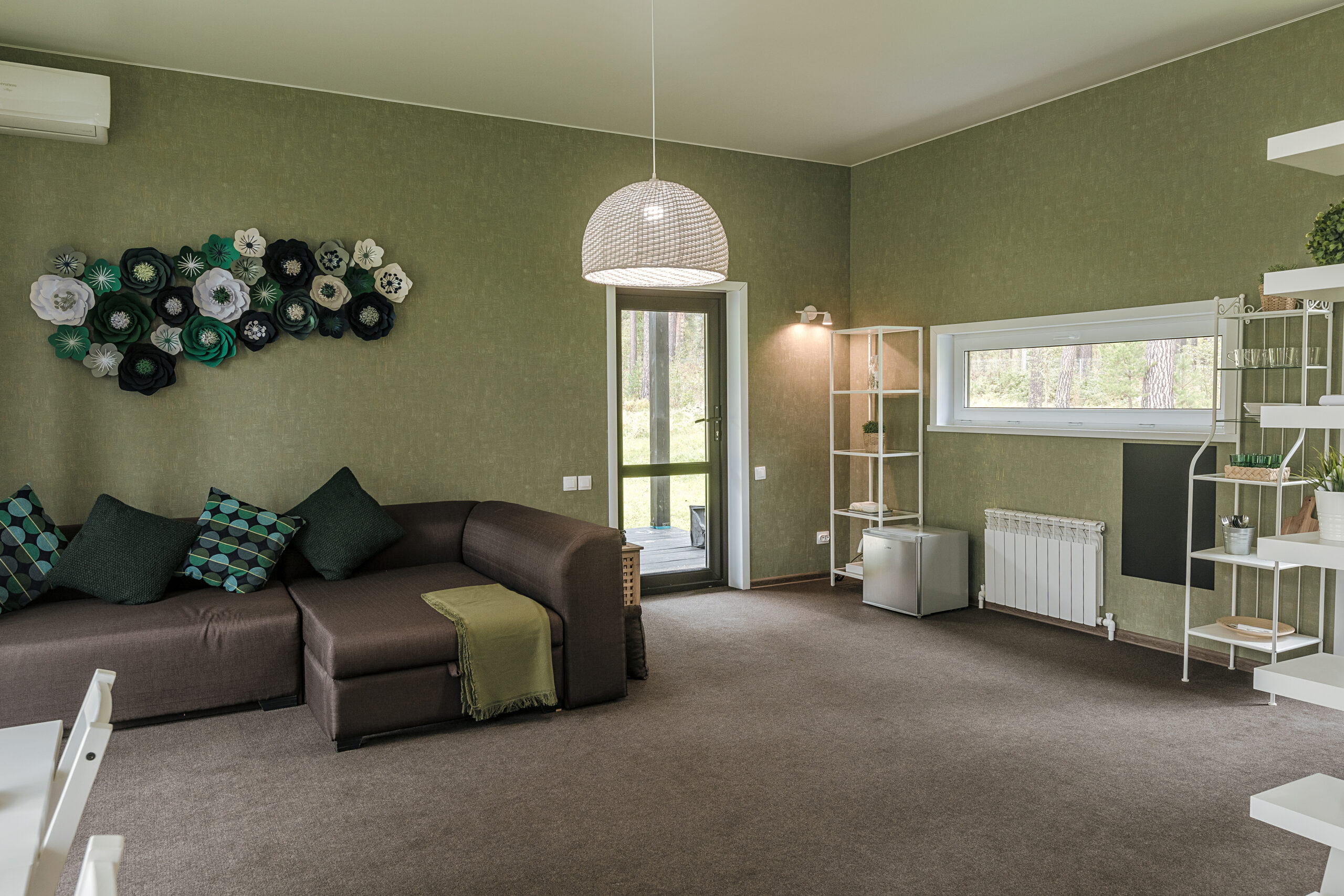
Green has become the defining neutral of modern American design. Moving past the bold statement colors of previous decades, today’s greens are complex, muted, and sophisticated, offering homeowners a deep connection to nature right inside their living space. A green living room feels restorative, organic, and effortlessly high-end.
At Maple Crest Painting, we know how powerful the right shade of green can be. We’ve compiled this guide to help you select the perfect nature-inspired hue for your home.
Why Green Works Perfectly for Living Rooms
Green is unique among colors because it is the most common color in the natural world. This familiarity makes it instantly appealing and calming to the human eye, establishing it as the ideal color for relaxation.
Brings a Sense of Calm and Balance
Psychologically, green is associated with tranquility, health, and renewal. Using it in your living room—the space dedicated to rest and socializing—can significantly reduce stress and promote a feeling of balance.
- Restorative: Unlike highly stimulating colors like red or yellow, green demands very little from the eye, allowing the mind to relax and unwind after a busy day.
- Versatility: Green acts as a visual anchor. Its deep connection to the earth makes it an exceptional grounding element for rooms featuring bright colors or busy patterns in the decor.
Complements Both Modern and Traditional Interiors
Green’s expansive range of tones—from cool blue-greens to warm yellow-greens—allows it to adapt to any style of architecture and furnishing.
- Traditional: Deep olive, moss, and emerald greens pair beautifully with classic materials like dark wood paneling, ornate trim, and heavy velvet fabrics, evoking a timeless library or study feel.
- Modern: Light sage, muted mint, or sharp, crisp celadon greens complement minimalist lines, concrete, glass, and geometric furniture, providing a fresh, organic contrast to sleek design.
Trending Shades of Green
The most popular greens today are characterized by their muted quality, often containing gray or brown undertones that make them feel mature and livable rather than overly bright or juvenile.
Sage Green – Soft and Timeless
Sage is arguably the most popular green in recent years. It is a grayed-out, soft shade of green that is quiet, complex, and operates almost as a neutral.
- Atmosphere: Sage is the perfect choice for a living room where you want a sense of color without the commitment of a vibrant hue. It creates an atmosphere of gentle, easy-going sophistication.
- Best Use: It works well in any lighting and is a fantastic choice for open-concept spaces where you want continuity without resorting to plain white or gray.
Olive and Moss Green – Cozy and Sophisticated
These are deeper, earthier greens that lean toward yellow and brown undertones. They evoke the rich patina of vintage goods and the deep woods of the forest floor.
- Atmosphere: These shades are excellent for creating a moody, cozy, and highly sophisticated living room. They work especially well when paired with warm light sources to enhance their depth.
- Styling: Use them to complement cognac leather furniture, dark brass lighting, and thick, woven area rugs to achieve a luxurious, enveloping feel.
Deep Forest Green – Bold and Elegant
Also known as Hunter or Emerald green, this shade is a dramatic, deep, and highly saturated choice that reads as confident and elegant.
- Atmosphere: Forest green is ideal for creating a “jewel box” effect in a smaller living room or on an accent wall. It is a bold backdrop that instantly makes any piece of art or colorful furniture pop.
- Contrast: To prevent the room from feeling too cave-like, always pair deep forest green walls with bright white trim and ceiling paint to add crisp architectural relief.
Pairing Green with Other Colors
Green is one of the easiest colors to pair because it is found everywhere in nature, where it naturally coexists with a wide variety of hues.
Combine with Warm Neutrals for Harmony
Warm neutrals provide the perfect counterpoint to the cool or earthy qualities of green, ensuring the room remains inviting and balanced.
- Creamy Whites and Taupe: Use creamy off-whites for ceilings and trim, and bring in taupe or warm gray for upholstery and rugs. This combination prevents the green from feeling too intense and keeps the overall palette soft and layered.
- Natural Wood Tones: Green has an immediate affinity for wood. Walnut, oak, and hickory furniture provide necessary warmth and texture, grounding the room beautifully.
Use Gold or Brass Accents for Luxury
Metallic accents are essential to giving a green living room a polished, high-end look.
- Brass: Brushed or antique brass (not overly shiny gold) is the go-to metallic for green. The warm, yellow-gold tone sits directly opposite green on the color wheel, creating maximum contrast and making both the paint and the metal look richer. Use brass for cabinet hardware, lamp bases, and picture frames.
- Black: Matte black fixtures and iron frames provide a stark, modern counterpoint to green, particularly effective when paired with deep forest or sage tones.
Maple Crest Painting Tips
Achieving the perfect look requires attention not just to color, but also to application technique and finish choice.
Choose Matte Finish for Soft, Organic Looks
The sheen level dictates how light reflects off your walls, and with green, matte is almost always the superior choice for a living room.
- Depth and Softness: A high-quality matte or flat finish absorbs light, enhancing the inherent depth and subtlety of the green pigment. This creates the soft, velvety, organic look that is trending today, minimizing wall imperfections.
- Sheen Contrast: Reserve a slight sheen (satin or semi-gloss) for the trim and doors to provide the subtle visual relief and contrast needed to define the architecture.
Test Undertones Under Natural Light
Green is notoriously tricky because it can carry strong undertones that are only revealed in certain lighting conditions.
- The Blue/Yellow Problem: Some greens can flash unexpectedly blue (making the room feel cold) or yellow (making the room feel sickly).
- Testing Protocol: Always paint large swatches (at least two feet by two feet) directly onto your wall. Observe the samples at multiple times throughout the day—morning sun, midday direct light, and evening indoor light—to ensure the undertone remains pleasing across all conditions.
FAQs
What’s the most popular green for living rooms in 2025?
While trends fluctuate, the most popular and safest choice remains Sage Green (or a similar muted, gray-green). It strikes the perfect balance: it reads as a color, yet functions as a neutral, making it versatile enough to accommodate various styles without feeling overwhelming.
How do I make green walls look modern?
To ensure your green walls feel contemporary and fresh:
- Use High Contrast Trim: Pair the green walls with a crisp, pure white or a stark black trim color instead of an off-white. This contrast creates sharp, modern lines.
- Minimalist Furniture: Opt for simple, low-profile furniture and avoid overstuffed or overly traditional shapes.
- Clean Artwork: Choose large, abstract or line-art pieces with stark white backgrounds to prevent the decor from competing with the wall color.
Ready to embrace the fresh, calming power of green in your living room? The professionals at Maple Crest Painting are here to ensure a perfect, beautiful finish.
Transform your living space into a restorative retreat. Contact Maple Crest Painting today for a professional consultation and estimate!