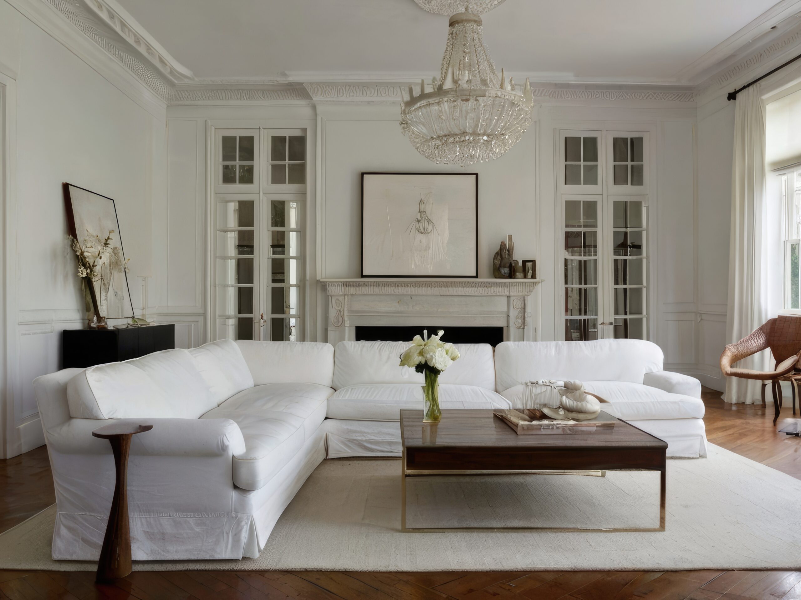
In home design, true elegance is often found in simplicity. Neutral paint colors are the backbone of timeless design, providing a serene backdrop that allows furnishings, art, and architectural details to shine. Far from boring, the right neutral shade adds subtle complexity, depth, and an immediate sense of quiet sophistication to your living room.
At Maple Crest Painting, we specialize in selecting and applying these subtle shades that enhance your home’s inherent beauty. Here is our guide to choosing the perfect neutral palette.
Why Neutral Colors Are Always in Style
A living room painted in a carefully selected neutral is never out of date. The power of these shades lies in their inherent flexibility and their ability to optimize the room’s environment.
Adaptable to Every Decor Trend
Neutral walls—including whites, beiges, grays, and greiges—provide a foundation that can adapt to rapid shifts in interior design trends.
- Flexibility: A greige wall, for example, looks just as sophisticated with Scandinavian minimalist furniture as it does with a maximalist, velvet-upholstered sofa.
- Easy Updates: When you wish to update your style, you only need to change your accessories (rugs, pillows, art) rather than undertaking the effort and expense of repainting the entire room.
Enhance Natural Lighting and Room Flow
Neutrals interact beautifully with light, often containing a higher Light Reflectance Value (LRV) than saturated colors.
- Light Amplification: Lighter neutrals reflect available natural light deep into the room, making the space feel larger, airier, and more open, which is essential for creating a comfortable atmosphere.
- Seamless Flow: In open-concept floor plans, using a consistent neutral color across adjacent spaces (living room, dining area, hallway) creates visual harmony. This continuity guides the eye effortlessly from one area to the next, promoting a cohesive, spacious flow throughout the home.
Best Neutral Shades for 2025
While classic, neutral trends evolve, favoring specific undertones that feel contemporary and fresh. For 2025, warmth is the dominant trend, making the room feel cozy and inviting.
Warm Beige and Sand for Cozy Interiors
The return of beige has brought with it a renewed appreciation for earth-toned neutrals. These shades infuse a room with genuine warmth.
- Effect: They pair beautifully with natural wood trim, woven textures, and soft lighting, creating a comforting, grounded atmosphere—often called a “cozy cocoon” look.
- Color Tip: Look for beiges and sand colors with subtle, barely-there gold or pink undertones. Avoid any shade that looks too yellow or orange to prevent it from appearing dated.
Greige for a Balance of Warmth and Modernity
Greige—the perfect blend of gray and beige—is the ultimate modern neutral, offering the best characteristics of both cool and warm palettes.
- The Versatile Neutral: Greige works as a bridge between warm furniture tones and cool, contemporary accents. It avoids the coldness associated with pure gray and the potential drabness of true beige.
- Selection Tip: Choose a greige that clearly leans one way or the other based on your existing decor. If your furniture is very warm, select a cooler greige. If your furniture is cool, select a warmer greige to balance the space.
Soft Whites and Off-Whites for Brightness
A bright, soft white is timeless, offering maximum light reflection and a clean, gallery-like feel.
- Off-Whites: These are whites with a hint of color—a drop of yellow, pink, or gray—that prevents them from looking stark or sterile.
- Example Application: An off-white with a warm, creamy undertone works exceptionally well in older homes with natural wood trim, providing contrast without appearing harsh. A soft white with a barely-there gray undertone is perfect for new construction where modern simplicity is key.
Decorating Tips with Neutral Walls
The greatest mistake when painting with neutrals is failing to introduce contrast. Neutral walls require depth and visual interest from other sources.
Add Texture Through Fabrics and Furniture
Since your walls are visually quiet, you must rely on tactile, varied textures to keep the room dynamic and interesting.
- Layering: Introduce layers of texture through textiles: a chunky knit throw blanket, linen curtains, a jute or sisal rug, and velvet or wool pillow covers.
- Contrast: Combine smooth surfaces (like leather upholstery or polished tables) with rougher textures (like raw wood or exposed brick) for a layered, high-end feel.
Accent with Metallic or Wood Finishes
Finishes and accents are the jewels of a neutral room, providing the necessary sparkle and contrast.
- Metallic Accents: Use metals to reflect light and add a pop of glamour. Brushed brass, antique gold, and matte black are excellent choices for table bases, light fixtures, and picture frames. The contrast between a cool gray wall and a warm brass lamp is highly sophisticated.
- Wood Finishes: Natural, unpainted wood brings necessary warmth and organic texture to any neutral palette. Ensure your wood tones (flooring, coffee table, shelving) are consistent in their undertone (e.g., don’t mix a very red cherry wood with a very gray oak).
Maple Crest Painting Pro Recommendations
Selecting the right product from a trusted supplier ensures your neutral color looks exactly as intended for years to come.
Best Neutral Paints from Sherwin-Williams and Benjamin Moore
We frequently recommend these industry-leading colors because of their reliable undertones and versatility:
| Brand | Recommended Color | Description | Undertone |
| Sherwin-Williams | Agreeable Gray (SW 7029) | A perfectly balanced greige that works in nearly all lighting conditions. | Warm Greige |
| Sherwin-Williams | Alabaster (SW 7008) | A soft, creamy white that avoids feeling cold or stark. | Warm White |
| Benjamin Moore | Revere Pewter (HC-172) | A historic color that reads as a deep, established greige. | Warm Greige/Taupe |
| Benjamin Moore | White Dove (OC-17) | A popular, slightly softened white that provides beautiful contrast to trim. | Soft, Creamy White |
How Finish Choice Impacts the Final Result
In a neutral color scheme, the paint finish (sheen) plays a critical role in the final aesthetic and durability.
- Matte or Flat (Recommended for Walls): This low-sheen finish is best for living rooms. It absorbs light, providing a rich, velvety depth that makes even a simple white look luxurious. It also helps to hide minor wall imperfections.
- Satin or Semi-Gloss (Recommended for Trim and Doors): The slightly reflective sheen of satin on the trim and doors provides a beautiful, subtle contrast to the flat walls, highlighting the architectural details while ensuring durability and easy cleaning in these high-touch areas.
FAQs
What’s the difference between warm and cool neutrals?
The difference lies in the color’s subtle undertone:
- Warm Neutrals: Have subtle undertones of yellow, orange, red, or brown (e.g., beige, sand, taupe, creamy whites). They create a cozy, intimate, and inviting atmosphere.
- Cool Neutrals: Have subtle undertones of blue, green, or violet (e.g., true gray, blue-white, minty greige). They create a crisp, clean, calm, and expansive atmosphere.
Do neutral walls go with dark furniture?
Absolutely, and they are often the ideal pairing. Using a light neutral (like soft white or pale greige) on the walls next to dark furniture (like navy, black, or deep leather) creates necessary contrast. This contrast prevents the dark furniture from dominating the room and makes the walls appear brighter, lending balance and sophistication to the space.
Choosing a neutral for your living room is an investment in timeless style. Let the professionals at Maple Crest Painting help you test samples and achieve a flawless, elegant finish.
Ready for timeless elegance? Contact Maple Crest Painting today for a professional color consultation and estimate!