The living room sets the tone for your entire home. Unlike bathrooms, which prioritize durability against moisture, the living room allows for greater design freedom, enabling you to choose colors that truly reflect your personal style and desired atmosphere. Whether you seek a cozy, cocooning feel or a bright, expansive space, the right color choice is paramount.
Maple Crest Painting has compiled this expert guide to help you navigate the trends and technical considerations for transforming your most important communal space.
What to Consider When Choosing Living Room Paint
A successful living room color scheme integrates seamlessly with the existing architecture and the room’s primary function. These two factors should drive your initial color palette choices.
Natural Light Exposure
The direction your living room faces fundamentally dictates how colors will appear throughout the day. A color swatch that looks beautiful under fluorescent store lights can look drastically different in your home.
- North-Facing Rooms: Receive cool, diffused, and often lower light. Colors in this room will appear deeper and more muted. To counteract the cool light, choose warm colors (red, orange, yellow undertones) or pure, clean whites to keep the space from feeling cold.
- South-Facing Rooms: Receive intense, bright, and warm light all day. This light is forgiving and handles almost any color well. Be mindful that light, warm colors may look over-saturated or overly yellow, so you might need to pick a slightly cooler version of your desired warm tone.
- East-Facing Rooms: Get bright, warm light in the morning, and cooler, shadier light in the afternoon. A balanced neutral (like greige) works well here, as it looks comfortable in both morning warmth and evening cool.
- West-Facing Rooms: Receive very warm, intense light in the late afternoon/evening, making colors glow. Use cooler colors (blue, green undertones) to balance this strong evening light, or embrace the warmth with deep, cozy tones.
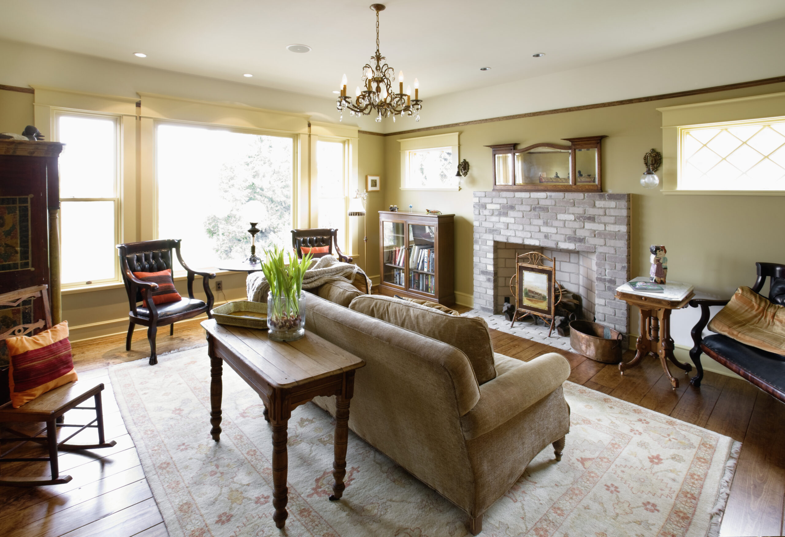
Furniture and Flooring Tones
Your paint color should harmonize with your large, fixed elements—your sofa, accent chairs, rugs, and especially your flooring.
- Flooring Undertones: Hardwood floors, rugs, and tile all have inherent warm (red, yellow, orange) or cool (gray, blue) undertones. The wall color should complement this. For example, if you have rich, dark cherry or walnut flooring (warm), a cool-toned gray wall might clash, whereas a warm taupe or creamy white would feel cohesive.
- Furniture Scale: If you have massive, dark, or heavily textured furniture, a light wall color will create relief and prevent the room from feeling heavy. If your furniture is light, minimalist, and low-profile, you have the flexibility to use a darker, more dramatic wall color.
Trending Living Room Colors
Contemporary design favors colors that are sophisticated, livable, and provide a sense of calm sophistication.
Warm Neutrals Like Beige and Taupe
After years of cool gray dominance, the pendulum has swung back toward warmer neutrals. These colors offer a sense of comfort, grounding the space and pairing effortlessly with natural materials like wood, wool, and leather.
- Beige and Taupe: These shades are softer, richer, and far more complex than the beige of previous decades. They have subtle green or pink undertones that keep them from looking flat. They are perfect for achieving the highly sought-after, cozy, European-inspired aesthetic.
- Effect: They make a room feel intimate, safe, and are the ideal backdrop for exhibiting art or colorful textiles.
Soft Gray for Minimalist Design
Gray remains a powerful neutral, especially for homes aiming for a crisp, modern, or Scandinavian-inspired minimalist look. The key is choosing the right gray.
- Avoid True Blue-Grays: For a welcoming space, select grays that lean slightly greige (containing beige/brown undertones) or have a very subtle, warming green undertone. These feel less institutional and more organic.
- Minimalist Function: Soft gray provides a quiet, unobtrusive backdrop that allows architectural details, interesting textures, and statement furniture to take center stage.
Olive, Navy, and Terracotta for Bold Statements
Using deep or highly saturated colors in a living room is a commitment that yields a dramatic, sophisticated reward.
- Olive Green: A rich, nature-inspired hue that acts as a deep neutral. It pairs exceptionally well with brass accents and mid-century modern furniture, creating depth without feeling overwhelming.
- Navy Blue: Classic and dramatic, navy can be used on all four walls in a small room to create a “jewel box” effect, especially when paired with a white ceiling and trim. It provides a formal, elevated atmosphere.
- Terracotta/Rust: A deeply warm, earthy color that has gained popularity. It instantly injects Mediterranean or Southwestern flair and creates an enveloping sense of warmth, particularly effective in west-facing rooms where the setting sun enhances its richness.
How to Balance Wall Colors with Decor
Color is the foundation, but texture and accessory placement bring the room to life. Achieving balance is crucial, especially in open-concept floor plans.
Neutral Walls + Colorful Accessories
This approach maximizes flexibility and minimizes the risk of buyer’s remorse.
- Maximum Versatility: By using a versatile neutral (white, greige, soft gray) on the walls, you ensure that the walls are the silent backdrop, not the main focus.
- Easy Refresh: You can easily change the entire mood of the room—from coastal to bohemian to formal—by swapping out inexpensive, colorful elements like throw pillows, area rugs, blankets, and table lamps, without ever needing to repaint the walls.
Using Accent Walls to Define Open Spaces
In modern open-concept homes where the kitchen, dining, and living rooms flow together, paint color is an invaluable tool for zoning.
- Define the Zone: Use a bold color (one of the statement colors above) on one strategic wall in the living area—such as the wall housing the fireplace or the media center. This contrast visually separates the living area from the rest of the open space, making it feel like a defined room.
- Architectural Feature: An accent wall draws the eye and highlights a specific architectural feature, like built-in shelving or a unique window.
Maple Crest Painting Tips
From preparation to the final coat, our professional painters use techniques that enhance both the aesthetics and durability of your living room paint job.
Combine Matte and Satin Finishes for Depth
While the paint color is the main feature, varying the sheen can add subtle, high-end complexity to your room.
- Matte/Flat Finish: Use a high-quality matte or flat finish for the main walls. This sophisticated finish absorbs light, hiding minor imperfections and providing a soft, luxurious, velvety look.
- Satin/Semi-Gloss Finish: Use a satin or semi-gloss finish for all trim, doors, and window casings. The slightly reflective sheen of the satin finish contrasts beautifully with the matte walls, highlighting the architectural trim and adding a necessary layer of visual depth and dimension.
Sample Paint in Daylight Before Committing
This simple step prevents the most common repainting mistake.
- Testing Protocol: After applying your test swatches, observe the color at least three times over a 24-hour period: early morning, midday, and after sunset with only your interior lighting on.
- The Power of Time: The same color can shift from a calming gray at noon to a lavender-tinged blue at dusk. Never commit to a color until you are certain how it behaves under all lighting conditions present in your specific space.
FAQs
What color paint makes a living room look bigger?
To maximize the perceived size of a living room, use light, cool-toned colors such as pale blues, seafoam, or off-whites. These colors naturally recede, creating an illusion of depth and distance. To enhance this effect, paint the trim and baseboards the same color as the walls, reducing contrast and blurring the room’s boundaries.
Should the ceiling be lighter or darker than the walls?
The traditional and safest choice is to paint the ceiling a color that is lighter than the walls (usually a crisp white). This draws the eye upward and reinforces the perception of height.
However, for a very cozy, intimate, or dramatic effect (often called the “fifth wall”), you can paint the ceiling the same color as the walls, or a shade slightly darker. This creates a cozy, cocooning atmosphere, best reserved for rooms where intimacy is preferred over airy spaciousness.
Your living room deserves a professionally applied finish that showcases your unique style. Let the experts at Maple Crest Painting bring your color vision to life with precision and quality.
Ready to make a sophisticated, welcoming statement? Contact Maple Crest Painting today for a detailed consultation and estimate for your living room project!