After years dominated by cool grays and crisp whites, the pendulum of interior design has swung back toward warmth. Today’s most sophisticated living rooms feature warm neutral paint colors—beiges, tans, greiges, and taupes—that infuse spaces with a comforting, welcoming glow. These colors provide a soft, rich background that makes a home feel instantly cozy and collected.
At Maple Crest Painting, we understand that a warm neutral is anything but boring. It’s the essential ingredient for creating a timeless, inviting living space.
Why Warm Neutrals Are Perfect for Living Spaces
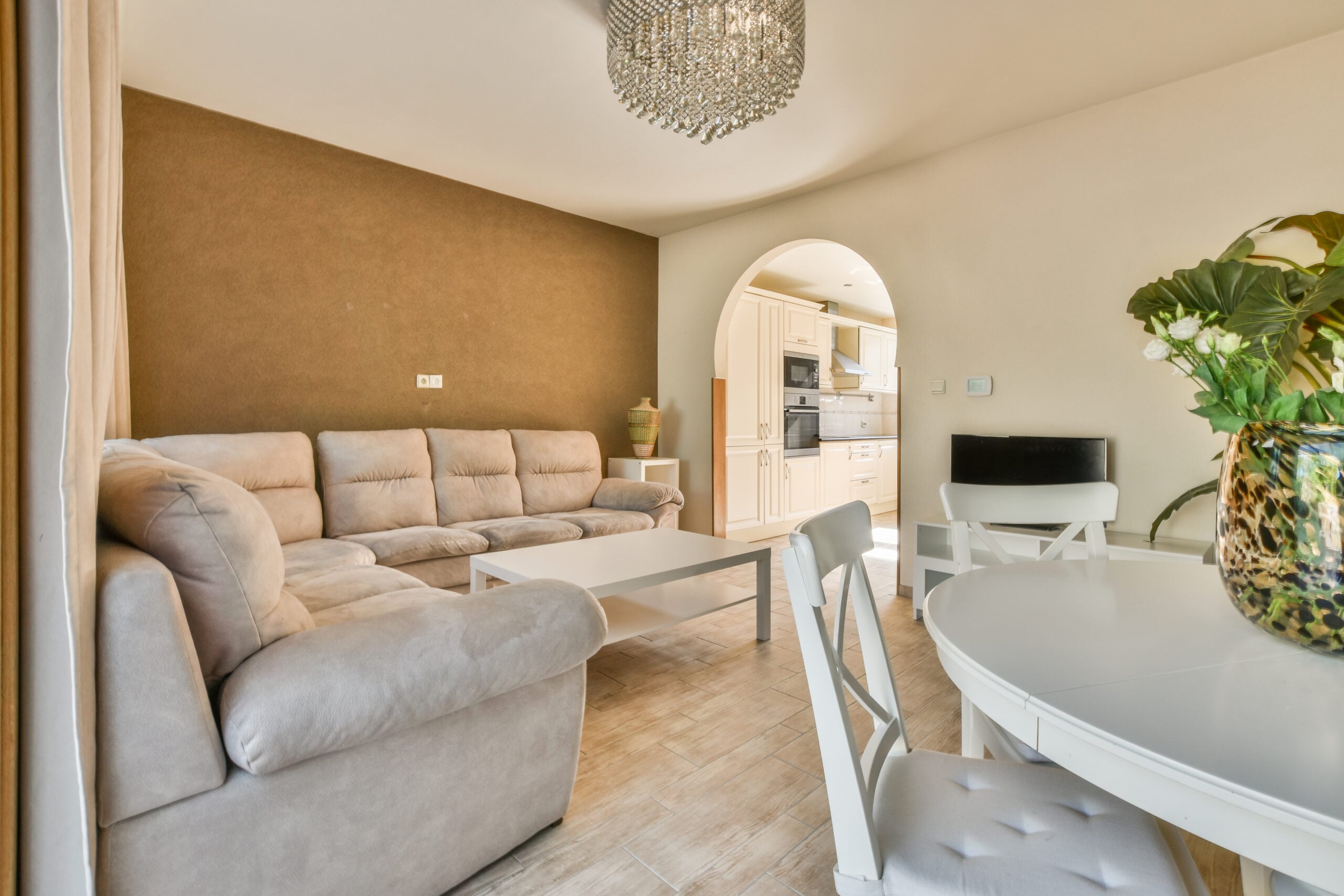
Warm neutrals are defined by their subtle yellow, red, or brown undertones, which counteract the sometimes stark or cool feeling of pure white or gray.
Create a Comfortable and Welcoming Atmosphere
The primary benefit of a warm neutral is its psychological impact. Colors with yellow and red bases, like beige and tan, are inherently associated with sunlight, firelight, and the earth, instantly promoting feelings of security and well-being.
- Flattering Light: Warm neutrals are particularly excellent for living rooms because they reflect light softly, giving a gentle, flattering quality that enhances skin tones and makes the room feel brighter, yet never harsh.
- The Hug Effect: In spaces where family gathers, a warm palette envelops the occupants, making the room feel like a true retreat from the outside world.
Pair Beautifully with Any Design Palette
Unlike bolder colors that dictate the entire design scheme, warm neutrals act as a sophisticated anchor, allowing you total freedom with your furniture, art, and accessories.
- Contrast for Cool Colors: They provide a beautiful depth when paired with cool accents, like deep blue velvet upholstery or stainless steel fixtures. The contrast makes both colors feel richer.
- Harmony for Warm Colors: Warm neutrals complement and amplify the beauty of other warm materials, such as bronze metals, terracotta pottery, and rich cherry or mahogany wood furniture.
Popular Warm Neutral Shades
The category of “warm neutral” is extensive and includes three major sub-families, each offering a distinct mood and style for your living room.
Beige and Tan – Classic Warmth
Beige and tan represent the traditional warm neutral. They have strong yellow or brown undertones and range from creamy, pale sands to deep, rich camel tones.
- Modern Beige: Forget the pale, flat beige of decades past. Modern beige is complex, often leaning slightly toward linen or flax, which gives it a subtle, elegant texture when applied to the wall.
- Best Use: These colors are ideal for creating a traditional or transitional living room and work beautifully with ornate trim and classic architectural features.
Greige – A Modern Balance Between Gray and Beige
Greige is the ultimate balanced neutral, mixing grey’s sophistication with beige’s warmth. It has been the top-selling paint category for years precisely because it avoids being too cool or too yellow.
- The Sweet Spot: Greige is perfect for homeowners who love the idea of grey but need the assurance that their room will not feel cold. The beige undertone ensures a welcoming atmosphere, even in rooms receiving cool, northern light.
- Versatility: It’s the go-to choice for open-concept homes as it transitions flawlessly between rooms and works with both cool-toned countertops (like marble) and warm wood flooring.
Taupe – Refined and Versatile
Taupe is a sophisticated cousin of greige, defined by its darker, moodier brown-gray base that often carries a reddish or violet undertone.
- Refinement: Taupe is a deeper color choice that offers a high level of refinement. It’s particularly effective in spaces designed for quiet contemplation, like a formal living room or reading nook.
- Creating Depth: Using a deep taupe allows you to create instant architectural depth. It looks phenomenal against crisp white crown molding and trim, providing a beautiful, rich contrast that feels luxurious.
Decorating with Warm Neutrals
Once your warm neutral is on the walls, smart decorating choices will elevate the room from simple to stunning.
Combine with White Trim for Contrast
The simplest and most effective way to make a warm neutral wall color look intentional and sophisticated is by pairing it with contrasting trim.
- The Pop Effect: Use a crisp, clean white with a slight cool undertone (like a pure white or an almost-icy white) on the trim and ceiling. This contrast makes the trim stand out, defining the architectural lines, while simultaneously making the warm wall color appear even richer and cozier.
- Sheen Matters: Ensure your trim is painted in a semi-gloss or satin sheen while the walls are in a flat or matte finish. The difference in light reflection adds another layer of visual interest.
Use Natural Textures Like Wood and Linen
Warm neutrals thrive when layered with organic materials, which enhances the color’s connection to the natural world.
- Textile Focus: Use upholstery and window treatments in natural fabrics like linen, thick cotton canvas, and wool. Look for furniture in rich, textural fabrics like bouclé or tweed.
- Wood Furniture: Ensure your furniture includes natural wood pieces—coffee tables, side tables, and shelving. Darker woods (walnut, mahogany) provide a rich contrast, while lighter woods (ash, maple) maintain a bright and airy feel.
Maple Crest Painting’s Expert Tips
Choosing the right warm neutral requires careful testing, as these colors are highly reactive to the light in your home.
Test Tones in Morning and Evening Light
Warm neutrals, particularly greige and taupe, contain a multitude of subtle pigments that can shift dramatically depending on the time of day and light source.
- Morning Light: Morning light (which is generally cooler and blue-toned) can pull the gray out of a greige, making it look cooler than expected.
- Evening Light: Warm interior lighting (incandescent or soft white LEDs) will enhance the yellow and red undertones, making the wall color appear significantly warmer and more beige.
- Testing Protocol: Always paint large swatches on at least two different walls (facing different directions) and live with them for a few days to see how they perform throughout a 24-hour cycle.
Add Accent Walls for Depth and Personality
While warm neutrals work beautifully throughout a room, strategically adding a darker accent can give your living room depth and a custom, high-end feel.
- The Feature Wall: Consider painting the fireplace wall or the wall behind your main sofa a deeper shade of the same color. For example, if you use a light greige on three walls, use a deep taupe on the feature wall.
- Built-ins: Paint built-in shelving or bookcases in a color two shades darker than the main wall color. This creates a subtle visual shadow box effect, adding sophistication without introducing a contrasting color.
FAQs
Are warm neutrals still in style for 2025?
Absolutely. Warm neutrals have moved beyond being a trend and are now considered a foundational element of enduring style. While the ultra-cool grays are phasing out, the versatility and cozy nature of greige and rich taupes ensure their continued dominance in residential design. They represent a timeless elegance that feels current yet classic.
Which furniture colors pair best with beige walls?
Beige and tan walls pair beautifully with the following:
- Deep Jewel Tones: Colors like emerald green, sapphire blue, and ruby red velvet provide stunning, rich contrast against the soft beige backdrop.
- Black and White: Crisp black and white modern furniture or patterned rugs give a sophisticated, graphic pop against warm walls.
- Cream and Ivory: Using slightly lighter shades of the wall color (creamy whites and ivories) for large pieces like sofas and chairs creates a subtle, monochromatic, and highly luxurious tonal effect.
Your living room deserves to be a haven of cozy elegance. Let us bring our color expertise and professional finish to your next painting project.
Ready to experience the perfect warm neutral? Contact Maple Crest Painting today for a detailed consultation and professional estimate!