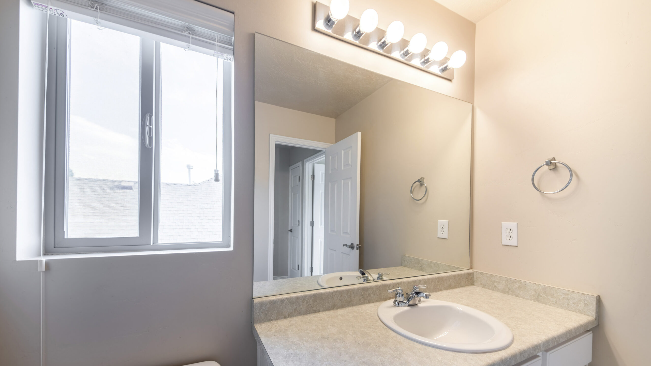
Choosing a paint color for your bathroom is about more than just aesthetics; it’s about selecting a hue that stands up to unique environmental conditions (high moisture) and coordinates with fixed elements (tile, vanity, fixtures). A well-chosen color can completely define the mood of the space.
At Maple Crest Painting, we guide homeowners through this process, focusing on durability and design cohesion. Here is our step-by-step guide to selecting the right paint color for your bathroom.
Consider the Mood You Want to Create
Before looking at swatches, decide on the primary emotional experience you want the room to provide. The color is the largest factor in setting this tone.
Spa-Like Tranquility vs. Modern Sophistication
| Desired Mood | Color Family | Example Shades | Key Characteristics |
| Spa-Like Tranquility | Soft, Cool Tones | Muted blues, pale greens, seafoam, light gray-blue. | These colors are calming, reminiscent of water and nature. They promote relaxation and cleanliness, making the bathroom feel like a peaceful retreat. |
| Modern Sophistication | Crisp Neutrals, Deep Accents | True white, charcoal gray, greige, navy blue. | A high-contrast scheme that feels intentional and chic. Often paired with clean lines, polished chrome, and minimalist decor. |
| Warm & Inviting | Earthy/Warm Tones | Blush, light terracotta, creamy beige, taupe. | These colors create a cozy, comforting atmosphere. They work best in traditional or transitional settings and pair well with brushed brass or bronze hardware. |
Factors That Influence Bathroom Color Choice
A bathroom is a complex space because it has more permanent, colorful fixtures (tile, toilet, sink) than any other room of its size. The paint color must complement these existing elements.
Natural vs. Artificial Light
The light source is the single biggest factor affecting how a paint color is perceived.
- Natural Light (Daytime): In rooms with natural light (windows), colors will appear truer. North-facing windows cast a cooler, bluer light, which makes cool colors look crisper but can make warm colors look dingy. South-facing windows cast warm, golden light, which is flattering to warm colors but can yellow out cool blues and greens.
- Artificial Light (Evening): Most LED and incandescent bathroom lights are warm (around 2700K to 3000K), which enhances yellow and red undertones. If you select a cool color, ensure it doesn’t look overly blue or purple under your fixtures at night. Always test your swatch under both lighting conditions.
Tile, Countertop, and Fixture Colors
The permanent finishes dictate the “rules” for your paint color. Ignoring their undertones will lead to a clash.
- Undertone Matching: If your countertop granite has a brown or pink undertone, choose a paint color (even if it’s a white or gray) with a warm undertone to match. If your shower tile is a cool, bright white, stick to paint colors with blue-gray undertones.
- Fixture Color: Standard white porcelain is universal, but if your fixtures are antique white or biscuit, a bright white paint will make them look yellow. Choose a slightly warmer, creamy white for your walls in this scenario.
Popular Bathroom Paint Color Ideas
These three general color categories offer reliable and stylish results in almost any bathroom setting.
Cool Tones Like Seafoam and Light Gray
These colors are ideal for small or windowless bathrooms because they visually recede and are highly light-reflective.
- Seafoam/Mint: A mix of green and blue with a lot of white pigment. It’s fresh, clean, and immediately evokes a tranquil, spa-like feel. It pairs well with white subway tile.
- Light Gray (with Blue Undertone): A perfect modern neutral that provides contrast against white trim and fixtures without being too dark. The blue undertone keeps it from feeling muddy or industrial.
Warm Tones Like Beige and Blush
Warm colors are cozy and intimate. They are excellent for creating a luxurious feel in large primary bathrooms or providing warmth in smaller rooms with minimal natural light.
- Creamy Beige/Taupe: These shades are timeless and forgiving. They are a staple of traditional design, creating a soft, enveloping hug of color that pairs beautifully with wood cabinetry and gold/bronze hardware.
- Blush/Pale Pink: Very light blush tones act almost like a neutral. They cast a flattering glow on the skin (a bonus for getting ready!) and look highly sophisticated when paired with white marble and black accents.
Accent Walls for Added Depth
If you are nervous about committing to a bold color, an accent wall is the perfect compromise.
- Where to Place: The best location for a bathroom accent wall is often the vanity wall or the wall behind the toilet, as these are the main visual focus points.
- The Effect: Use a deep color (like charcoal, emerald green, or deep teal) on this single wall to add depth and sophistication without overwhelming the entire space. Keep the remaining walls in a bright, coordinating white or light neutral.
Maple Crest Painting Pro Tips
Selecting the right color is only half the battle. Professional application and product choice are essential for a long-lasting, quality finish in a bathroom.
Always Test Paint Swatches On-Site
Never trust a color chip. Always buy sample pots of your top three choices and paint large (2-ft X 2-ft) swatches on multiple walls of your bathroom.
- Observe Throughout the Day: View the swatches in the morning, afternoon (with sunlight), and evening (with artificial lights on).
- Check Against Fixtures: Hold the swatch right next to your vanity countertop and shower tile to ensure the undertones match or complement each other perfectly.
Use Semi-Gloss for Durability and Easy Cleaning
In a high-humidity environment like a bathroom, the paint finish is more critical than the color.
- Semi-Gloss: We strongly recommend a semi-gloss finish for bathroom walls and ceilings. This sheen creates a durable, non-porous barrier that prevents moisture absorption, resists mildew growth, and allows for frequent scrubbing and cleaning without damaging the paint.
FAQs
What’s the most relaxing color for a bathroom?
The most relaxing colors are typically cool, muted tones. Soft greens (like sage or seafoam) and pale blues are considered calming and help reduce stress. They are psychologically linked to nature and cleanliness, immediately creating a sense of rest and retreat.
Should bathroom walls and ceilings be the same color?
It depends on the effect you want:
- To Maximize Height (Recommended for Small Bathrooms): Yes. Painting the walls and ceiling the same light color minimizes the visual line where the wall ends and the ceiling begins. This blurring effect makes the ceiling feel higher and the room feel airier.
- To Define the Ceiling: Use a crisp white on the ceiling and a color on the walls. This approach emphasizes the height and architectural lines but can visually lower a very low ceiling.
Your bathroom deserves a color that complements your fixtures and stands up to steam. Trust the experts to provide both the perfect color consultation and a guaranteed durable finish.
Ready to transform your bath with confidence? Contact Maple Crest Painting today for a professional consultation and estimate!