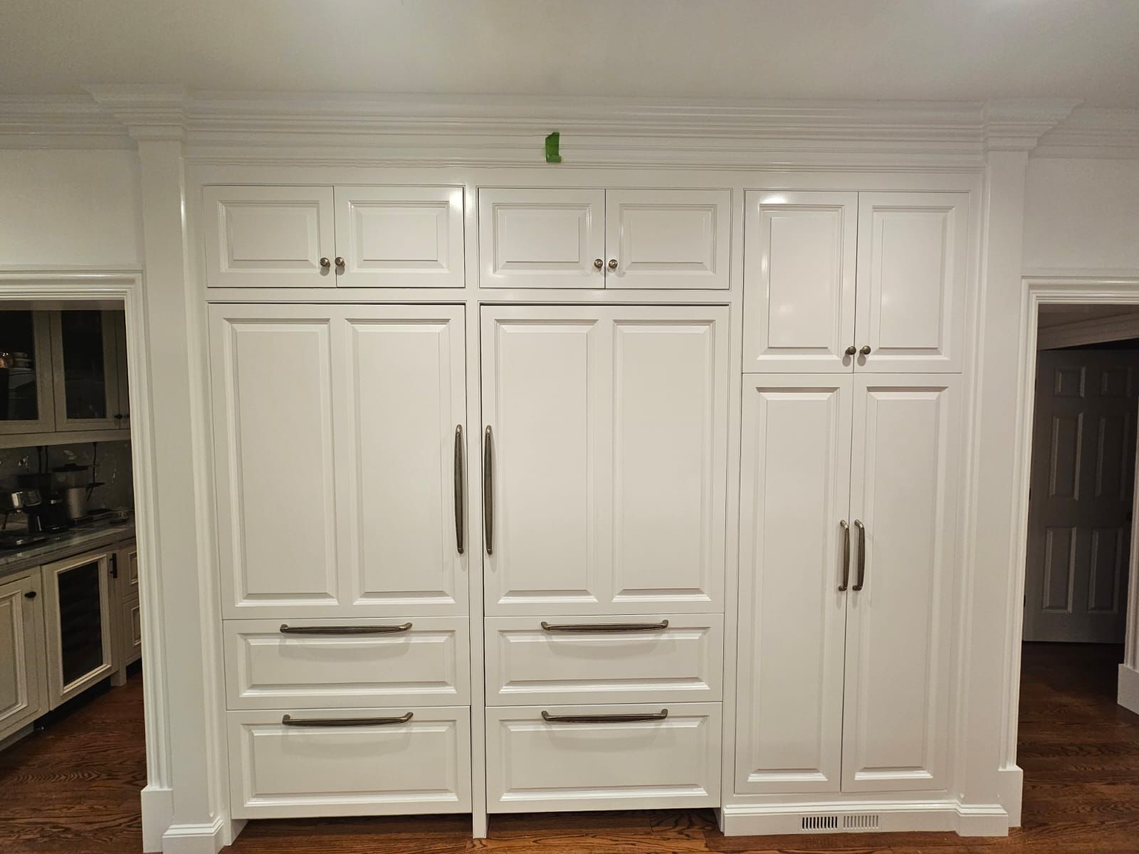
Choosing the perfect white for your kitchen cabinets can feel surprisingly overwhelming. White isn’t just one color; it’s a spectrum of hues, each with subtle undertones that can drastically change the mood of your kitchen.
At Maple Crest Painting, we know that getting the white right is the key to a successful kitchen transformation. Here is our expert breakdown of the best white paint colors, ensuring your cabinets look clean, bright, and timeless.
Why White Cabinets Never Go Out of Style
White is the default choice for a reason. Its inherent qualities make it the most versatile and enduring color option for kitchen design.
Versatility Across Design Trends
From the farmhouse aesthetic to ultra-modern, flat-panel cabinetry, white is the only color that seamlessly fits every design style.
- Traditional: White brightens up detailed molding and paneling without hiding the craftsmanship.
- Contemporary: A crisp, true white provides the necessary minimalist backdrop for sleek hardware and geometric lines.
- Transitional: White serves as the perfect neutral, tying together elements like stainless steel, natural wood, and bold light fixtures.
Easy to Pair with Any Countertop or Backsplash
Unlike specific colors like blue or green, which require careful coordination, white acts as a blank canvas. It allows you to feature other, more expensive elements in the room.
- Countertops: White cabinets enhance the movement and depth of high-contrast countertops (like dark granite or heavily veined marble) while creating a serene look when paired with lighter quartz or butcher block.
- Backsplashes: Whether you choose bright subway tile, patterned Moroccan mosaics, or a subdued vertical shiplap, white cabinets ensure the focus remains on the texture and pattern of the backsplash.
Best White Shades for Different Lighting
To truly understand which white is right for you, you must consider its undertones—the faint hints of color like blue, yellow, or gray—and how they react to the unique lighting in your kitchen.
Warm Whites for Cozy Kitchens
Warm whites carry subtle undertones of yellow, beige, or sometimes pink. They are the ideal choice for creating a cozy, welcoming atmosphere.
- Where to Use: In large, brightly lit kitchens (especially those with south-facing windows) that receive intense sunlight. The warm undertones prevent the intense light from washing out the cabinets, keeping the kitchen feeling comfortable rather than stark.
- Visual Effect: They pair beautifully with oil-rubbed bronze or antique brass hardware and warm wood floors.
Cool Whites for Modern, Sleek Looks
Cool whites have blue, gray, or sometimes purple undertones. They create a clean, contemporary, and crisp aesthetic.
- Where to Use: In kitchens that receive less natural light (like those facing north or in shadowed areas). The blue-gray undertones counteract the yellow cast of artificial lights, helping the white appear brighter and cleaner.
- Visual Effect: These shades look fantastic with polished chrome or stainless steel hardware and modern concrete or simple white subway tile backsplashes.
True Whites for a Classic, Crisp Finish
A true white is the purest form of white with minimal visible undertones. It serves as a perfect, uncompromising neutral.
- Where to Use: When you want the absolute highest contrast possible between the cabinets and a dark wall color or backsplash. They work well in high-gloss, ultra-modern settings.
- Visual Effect: They offer a gallery-like backdrop, demanding perfection in the paint finish itself, but providing an incredibly crisp look.
Expert Tips for Choosing the Right White
The right white is always found on the wall, not on a tiny paint chip.
Test Samples in Natural and Artificial Light
Paint color changes dramatically based on the light source. A color that looks perfectly neutral in the store under fluorescent lights might appear yellow under your warm LED bulbs at night, or icy blue in the morning light.
- Best Practice: Purchase sample pots and paint 1-ft x 1-ft swatches directly onto your cabinet surface (or on large pieces of cardboard taped to the cabinets). Observe these swatches at different times of the day—morning, noon, and evening—before making a final commitment.
Match Undertones with Your Wall or Floor Color
A professional always looks at the entire room before suggesting a white. If your wall paint has a strong pink undertone, a white cabinet with a green undertone will clash dramatically, even if you can’t immediately see the undertone in the white itself.
- The Rule of Complements: Ensure the undertone in your cabinet white (warm or cool) complements the undertone of the largest surrounding color surface, whether that’s the wall, the floor, or the permanent stone backsplash.
Maple Crest Painting Recommendations
Based on our experience delivering high-end, durable finishes in kitchens across the US, these are our most requested and reliable white cabinet colors from two major paint manufacturers.
Sherwin-Williams’ Most Popular Whites
- “Pure White” (SW 7005): This is a clean, bright, and nearly true white, but it has just the slightest touch of a cool, gray undertone. It avoids feeling sterile and is incredibly versatile, making it the most popular white for cabinets and trim.
- “Alabaster” (SW 7008): This is a gorgeous warm white with a soft, creamy undertone. It’s perfect for creating a cozy feel and pairing with warmer flooring or hardware (brass, bronze). It’s ideal for the modern farmhouse or classic traditional style.
Benjamin Moore’s Top Picks
- “Chantilly Lace” (OC-65): Often considered the gold standard for a true, unadulterated white. It contains minimal pigment and offers a clean, crisp finish, especially favored in modern and minimalist kitchens where a bright, stark look is desired.
- “White Dove” (OC-17): An incredibly sophisticated and highly popular warm white. It has a slight gray undertone that prevents it from looking yellow but is soft enough to avoid being stark. It pairs beautifully with almost any stone finish.
FAQs
What’s the most popular white cabinet color right now?
Currently, the most popular white is one with a soft, slightly warm undertone, such as Sherwin-Williams “Alabaster” or Benjamin Moore “White Dove”. These colors satisfy the desire for a clean white kitchen while providing a welcoming, homey feel that designers are currently prioritizing over bright, clinical whites.
Should I use satin or semi-gloss for kitchen cabinets?
We highly recommend Semi-Gloss as the superior finish for kitchen cabinets.
- Durability: Semi-gloss creates a harder, more resistant surface that stands up to frequent cleaning, moisture, and potential chipping better than lower sheens.
- Cleanability: Its smooth, high-sheen surface is non-porous and makes wiping away grease, fingerprints, and food splatter significantly easier.
- Aesthetics: The subtle sheen of a professional semi-gloss finish elevates the look, making the cabinets appear factory-finished and custom.
Selecting the perfect white is only the first step. The quality of the final finish—ensuring it is smooth, durable, and free of brush marks—requires professional degreasing, sanding, priming, and application with specialized spraying equipment.
Guarantee a Flawless, Factory-Smooth Finish for Your White Cabinets. Contact Maple Crest Painting Today for a Professional Consultation and Estimate!