
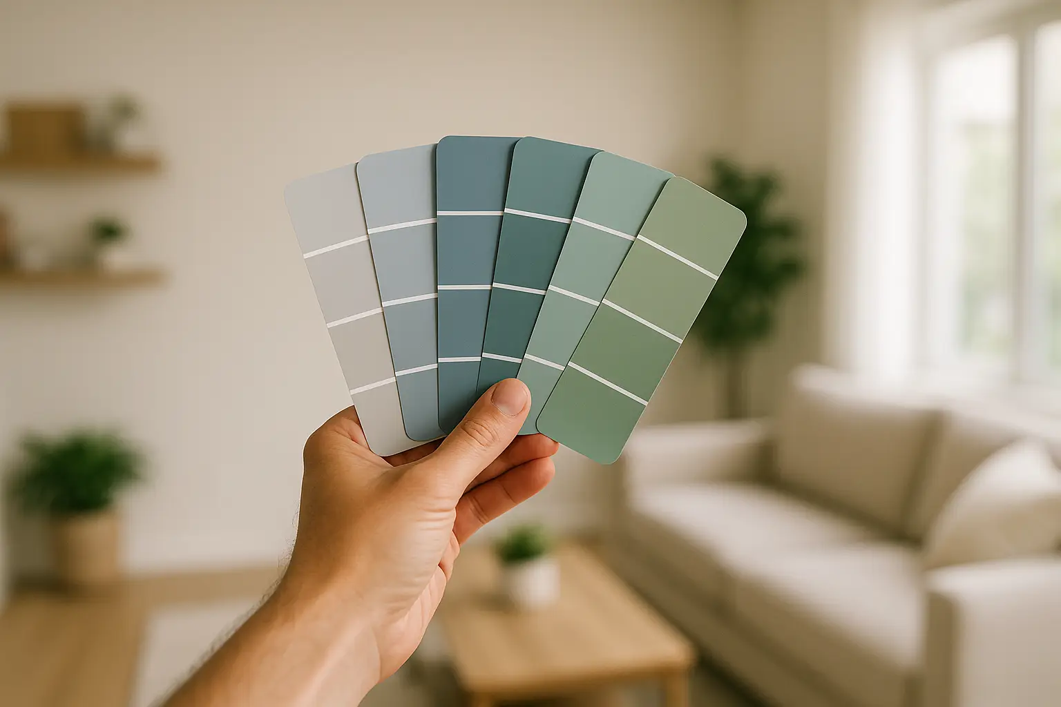
From Confused to Confident: A Guide to Choosing the Perfect Paint Color
Choosing a new paint color should be exciting, but for many homeowners, it quickly becomes overwhelming. With thousands of shades to choose from, how do you find the one that’s just right for your space? As a painting company with over 22 years of experience, we’ve helped countless clients navigate this process.
This guide will walk you through our proven tips to help you select the perfect interior paint color with confidence.
1. Start with Inspiration
Before you even look at a paint swatch, gather inspiration. Look at design magazines, Pinterest, or your favorite home decor blogs. What colors are you drawn to? Do you prefer warm, cozy spaces or cool, calming environments? Save images of rooms that you love and try to identify the common color threads.
Consider the existing elements in your room that won’t be changing, such as flooring, furniture, countertops, and artwork. Your new paint color should complement these fixed features.
2. Understand Undertones
This is where many people get tripped up. Every color, even whites and grays, has an undertone—a hint of another color (like blue, yellow, pink, or green). A gray with a blue undertone will feel cool and modern, while a gray with a yellow or “greige” undertone will feel much warmer.
To identify a paint chip’s undertone, compare it to a pure white. You can also look at the darkest color on the swatch strip, which will often reveal the true undertone more clearly.
3. Consider the Lighting
Lighting is one of the most important factors in how a color will look in your room. A color can look completely different in the morning light versus the afternoon sun, or under artificial lighting at night.
•Natural Daylight: Shows the truest version of a color.
•Incandescent Bulbs: Bring out warm tones and yellows.
•LED/Fluorescent Bulbs: Can cast a sharp, blueish light.
Never choose a color based on how it looks in the hardware store! Always test it in the room you plan to paint.
4. Test, Test, and Test Again!
This is the most critical step. Never commit to a color without testing it on your walls first. Paint a large sample (at least 2×2 feet) on the wall. Better yet, paint two coats onto a large poster board that you can move around the room.
Observe the color at different times of the day and in different lighting conditions. See how it looks next to your trim, your furniture, and your flooring. A color that looked perfect on a tiny swatch can feel completely different when it covers an entire wall.
5. Think About the Room’s Purpose and Mood
How do you want to feel in the space?
•Bedrooms & Bathrooms: Cool, calming colors like blues, greens, and soft grays often work well to create a relaxing retreat.
•Living Rooms & Kitchens: Warmer, more inviting colors can make these gathering spaces feel cozy and welcoming.
•Offices: Neutral or cool tones can promote focus and concentration.
6. Don’t Forget the Finish
The paint finish (or sheen) you choose will also impact the final look.
•Matte/Flat: Hides imperfections but is less durable. Best for low-traffic areas and ceilings.
•Eggshell/Satin: The most popular choice. Offers a soft glow, is more durable than matte, and is easy to clean. Great for living rooms and bedrooms.
•Semi-Gloss/Gloss: Highly durable and easy to clean. Ideal for trim, doors, and cabinets.
Still Feeling Stuck? Ask a Professional!
If you’re still unsure, don’t hesitate to ask for help. At Maple Crest Painting, we offer professional color consultations to help you find the perfect palette for your home. With our experience, we can guide you toward a choice you’ll love for years to come.
Ready to get started? Contact us today for your free estimate and color consultation!